Tuesday, December 14, 2010

ASIGNMENT 2 (e-Wallpaper)


For asignment 2, I have been assigned to create an e-wallpaper for the upcoming MMU open day in 2011. So I have the idea of conveying a simple and exclusive design for the wallpaper. Then I look for images that can illustrate the idea and I found a picture of MMU building but it has some writing on it. So i used the 'spot healing brush tool' and 'clone stamp' to get rid of the writings.


Then I started with the MMU logo on the left upper corner of the wallpaper using the 'Multiply' effect to get rid of the white background of the logo.

I decided to make a simple wordings with a little bit of font styles by editing the text spacing, size, and style in the 'Character' tab so that the text wont look boring.


Finally, I put on the MMU mascot and a Telekom Malaysia logo on the lower right corner of the wallpaper.

So this is my final look of FOM Open Day e- Wallpaper.


Thursday, November 25, 2010

ASSIGNMENT 1 (Fruit Face)


The first assignment is to create a face out of fruits.So the first thing that i did is to make the background blue and start with the face.

Then I start to build the eyes using the kiwi and blueberry.

Then I duplicate the eyes layers and use the "overlay" tool to ake the eyes image appears more vibrantly.


Now I will do the brows to complete the eye. I use the dark green vegetables to imitate the brows.

I used the "rectangle marquee" tool on the vegetable then I used the "quick selection" tool to get rid of the white background.
Then I placed it and adjust the size and angle using the free transform.
To make the red on the right end of the vegetables disappear, I start using the "clone stamp" tool. It is used to cloned the green side if the vegetable to cover up the red end of it.

To do the nose, I did the same thing with the eyes. I duplicate and overlay the layers to make it look more vivid. And i also used th esliced carrots for the nose.

Noe for the ears I just resize and angle it well to the face and I blend in the edge of the ears and face using the clone stamp tool. So that the edge looks more blurry and soft.

Then I used the mushroom as a hat.It really looks like a chef's hat so I used it just as that.

Finally for the mouth, I used the pasta. First I resize and put it in the right place on the face.
Secondly, I duplicate and overlay the layer so that the image appears darker and easier to set the tone.
Lastly, I used the "color balance" from the adjustment in the image menu to set the mouth color to pink.
So this is my version of a face created using fruits and vegetables.


Tuesday, September 7, 2010

Asingment 3 (Birthday Card)

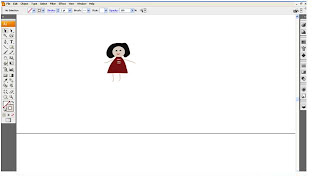
For this third assignment we are assign to do a modification to a birthday card so it will have a local elements to it.Here is the original card that i chose to do.

This is a birthday card of a nine year old boy who is wearing a taekwando attire.I have decided to put local elements by changing the boy's outfit to wearing a Baju Melayu. I draw the baju using the artistic calligraphic brush tool which create strokes that resemble those drawn with the angled point of a calligraphic pen and are drawn along the center of the path.


After i used the brush tool to draw the songkok and baju melayu, i want to add the colors of Malaysia's National Flag to the birthday card by using the Rectangle tool to create 6 rectangles with red blue white and yellow color.


Now i want to add a few more kids in the card so it will look more festive. So i start to draw Chinese and Indian girls because Malaysia is a multiracial country.Now i use the ellipse and charcoal brush tool to create it.


After finishing with drawing songkok, baju melayu,Indian and Chinese girls and the colors from the National Flag, here is my final output.


(1)I have use a birthday card for a nine years old boy who is wearing a songkok and baju melayu which is the tradisional attire for the Malays in Malaysia.

(2)Then i added Chinese and Indian girl just to convey that Malaysia is multiracial country and are supportive of each other.

(3)I also used a blue,red,white,yellow colors on the card because that is the colors in Malaysia's National Flag.The colors on the Malaysian Flag represent the following:

Yellow - the color of the royal family
White - peace and honesty
Red - hardiness, bravery, strength & valour
Blue - vigilance, truth and loyalty, perseverance & justice. The blue field also symbolizes the unity of the Malaysian people

Monday, August 9, 2010

ASIGNMENT 2

In this asignment i have chosen the 2011 New Year celebration for my calendar design.
First step I did is to create a detail design of numbers in the calendar. Using the rectangle tool to build a small and long rectangle. Also the use of pencil tool to build the little triangle at both ends of the rectangles.


Second step is to build the square to fill the dates and days.

Then I use the brush tool to write the dates in the box and the text tool to write the days.

Lastly, I use a picture of a fireworks to be the background of my calendar. and also use the transparent tool to make them blend in together nicely.

This is the final look for the calendar.


Sunday, July 11, 2010

ASSINGMENT 1 LOGO

(1) I used a fashion clothing brand logo which is Chanel. The founder of this brand, Gabriel Coco Chanel Rose is one of the premier fashion designer in Paris, France


Reference :
http://womenshistory.about.com/od/chanelcoco/a/coco_chanel.htm


(2) Then i came up with and idea to put it some Malaysian contemporary cloth material, batik. Batik is a well known traditional cloth material that is usually used by elderly generation.


(3) Then i applied it to Adobe Illustrator.


(4) After having both of the elements i want. I try to make the batik design as the background of this logo. I combined them together and make the Chanel logo appears on the batik design.


(5) After that, I make the Chanel logo transparent to the Batik design by using the Transparent tool from the Stroke tool. Then using the Multiply option to make the Chanel white background invisible.

https://blogger.googleusercontent.com/img/b/R29vZ2xl/AVvXsEh5B1S6jgJi7l47za9XrE0Ya94qkcJ3HQUgnNJY4MJ3aagNH74InOJSZKET957zg5rKdXqy_LJ532wfIqJCgcL1KMOfOZ0QAbt3J_NTHqxeFWxbVyigyrDuoyRiGOomJyYrJd7dxyFuT5w/s1600/progress6.JPG

https://blogger.googleusercontent.com/img/b/R29vZ2xl/AVvXsEi6gqHWw3npeJRPWkJVB4pwCTxkL0ukOaiv3k_F-PwpiiMiv4maNvEPdH5atVEgRpdSd9hwRmiltlcz0TkEqt1a8iiEa-5WlGrf84TOvetbiVXhPCrfXUpYvX3nRBom9YFP2QP1LWc54b8/s1600/progress7.JPG

(6) The last step is to make the Batik design background appear lighter. So, I used the Transparent tool from the Stroke tool to make it.


So this is the last result of the Chanel Fashion Clothing logo with a twist of Malaysian traditional style.

https://blogger.googleusercontent.com/img/b/R29vZ2xl/AVvXsEgFKqLAuiICyrJU9GzSPaeZSTwC9koWnYE2YytwA7JzFrB2bVWF049gkY_iO0VdI74jjqv5dCuQ_G_tyeO42iC-6CtcEteDxthusPXzPsN9issHehgg2bIhvnajBfzbyOoiwFD2PHj7qGI/s1600/channelmalaysia.JPG